Design
Design
Nothing grabs a reader’s attention quite like a captivating design. Sure, the first few sentences of a story can serve as a hook and keep the reader reading, but design is what the reader’s eyes are drawn to first. An attractive, engaging layout will force the casual peruser to pause for a second and maybe even dive into a story or two.
Below you can examine some of my designs throughout the years. From covers to interior pages, I’ve designed both newspapers and magazines, always seeking to create a more visually appealing package for the viewer.
Covers and Centerspreads
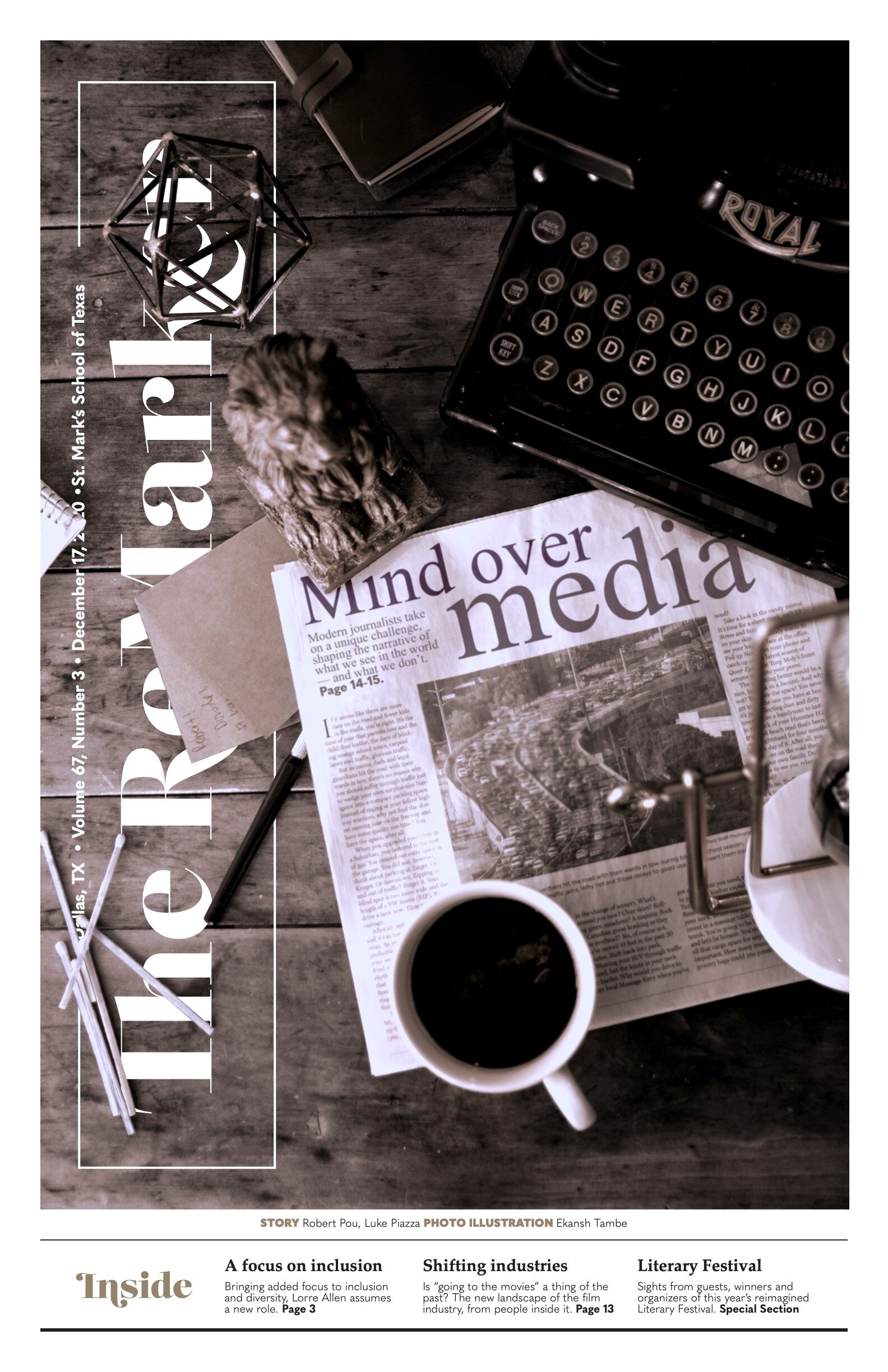
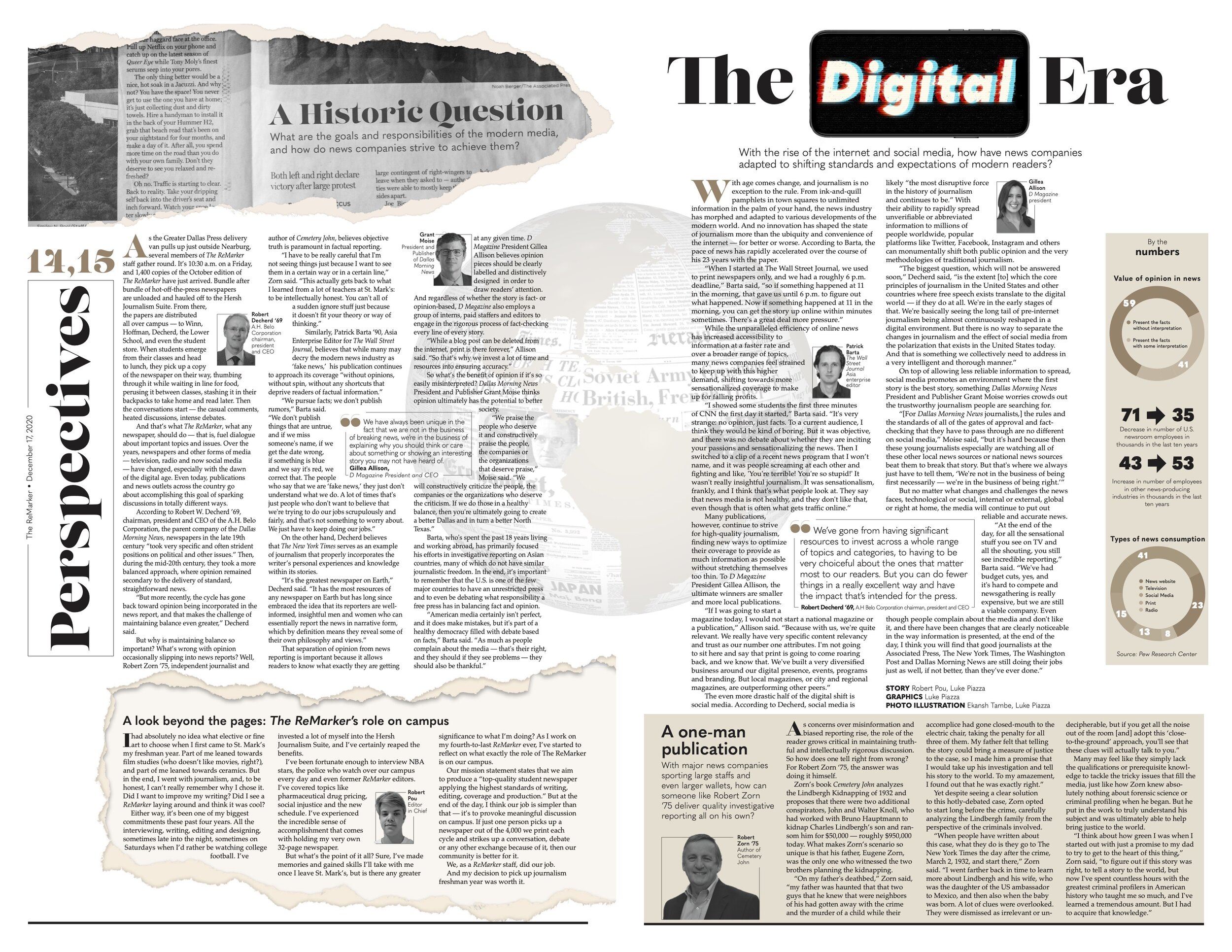
Our cover story for this issue centered around the role of media, the role student publications play at our school and a look at the changes in perspectives and values social media has brought forth.
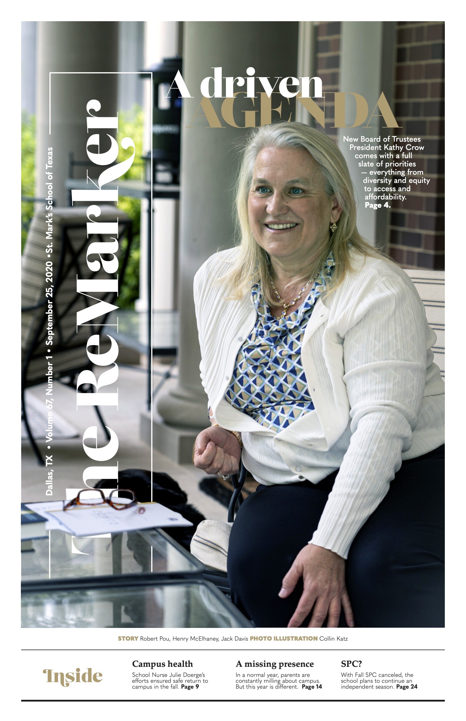
This was our first cover design which utilized our new design for the year. The cover featured an interview with Kathy Crow, the new Board of Trustees president, who became only the second female Board president in the school’s 110-year history.
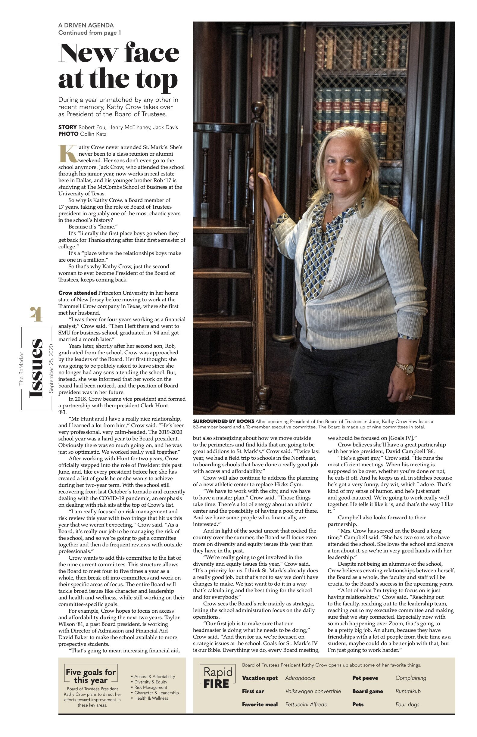
This was our first cover design which utilized our new design for the year. The cover featured an interview with Kathy Crow, the new Board of Trustees president, who became only the second female Board president in the school’s 110-year history.
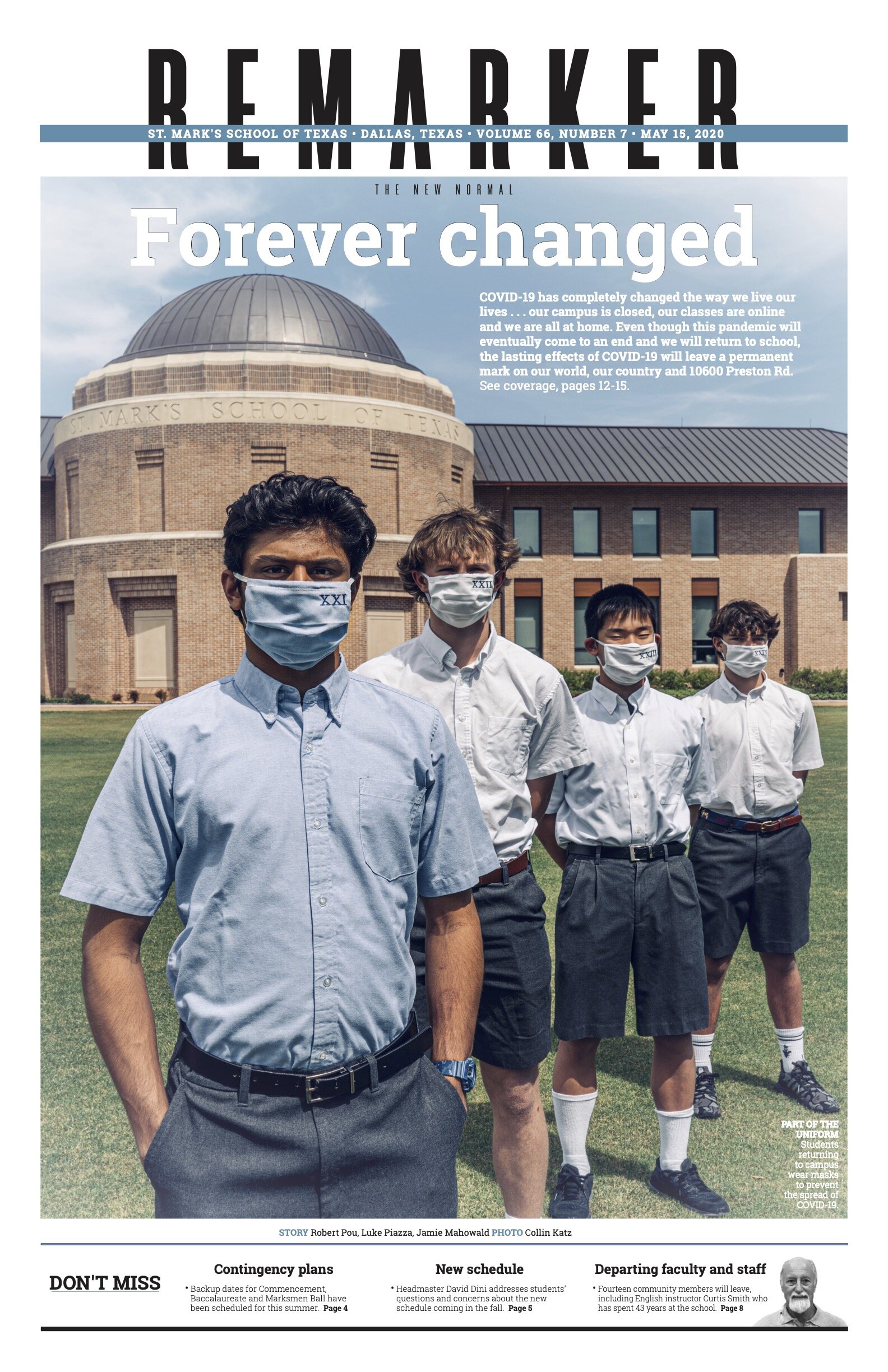
Because of the deepness with which COVID-19 was impacting the school we wanted to offer a look at all the ways the virus was affecting us. This cover shot was intended to suggest that school as we knew it would be forever altered.
Magazine

This feature was the first double page spread in our Focus magazine, whose theme was “Everybody has a story.” Because of COVID-19, we had to use photos sent by our school nurse and her husband — who became engaged after only two weeks of dating, which has led to a 46-year marriage. The magazine utilized an understated layout, in tones of red and grey.
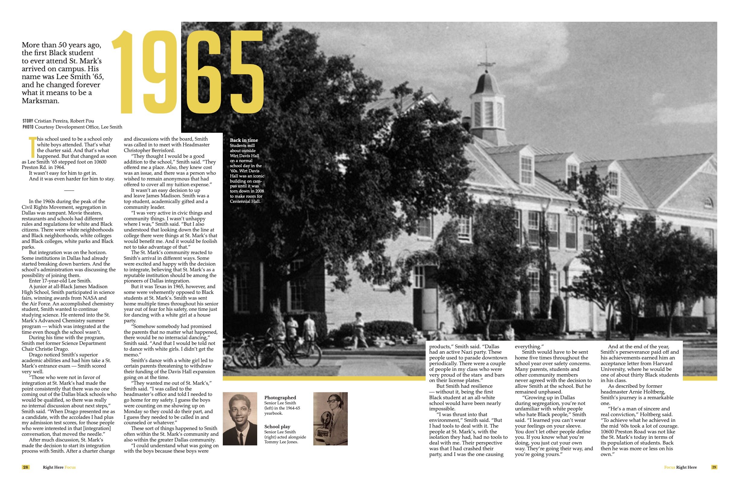
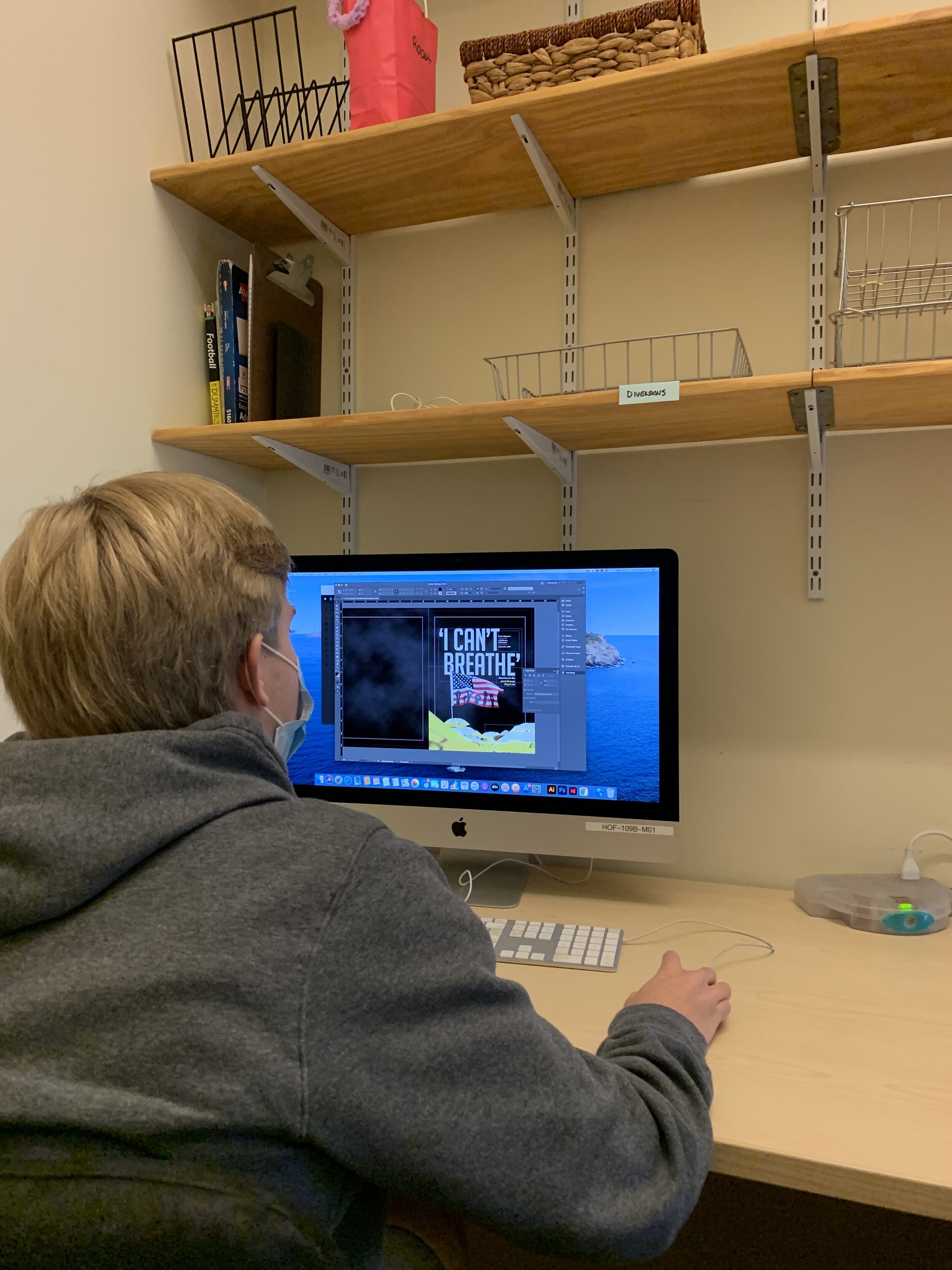
To tell the story of the school’s first Black graduate, I decided to use archival photos, along with a head shot provided by the subject as visuals. I chose the simple headlines of “1965” and “2020” to lead the reader into the story. The yellow spot color was inspired by the yellow caution tape around crime scenes, since this entire magazine’s theme was “America in the post-George Floyd era.”
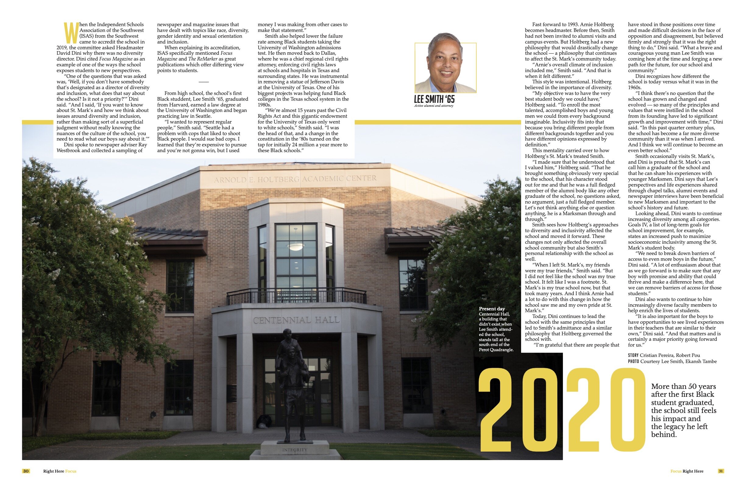
To tell the story of the school’s first Black graduate, I decided to use archival photos, along with a head shot provided by the subject as visuals. I chose the simple headlines of “1965” and “2020” to lead the reader into the story. The yellow spot color was inspired by the yellow caution tape around crime scenes, since this entire magazine’s theme was “America in the post-George Floyd era.”

This design was in our single-topic magazine, Focus. This particular issue told the immigration paths of people in our community — from Asia and Africa, from Australia to Northern Europe. We told the story of these families through a traditional food or meal they shared with us. I enjoyed getting to learn of the Csaky family’s journey from Hungary — and the goulash was delicious!
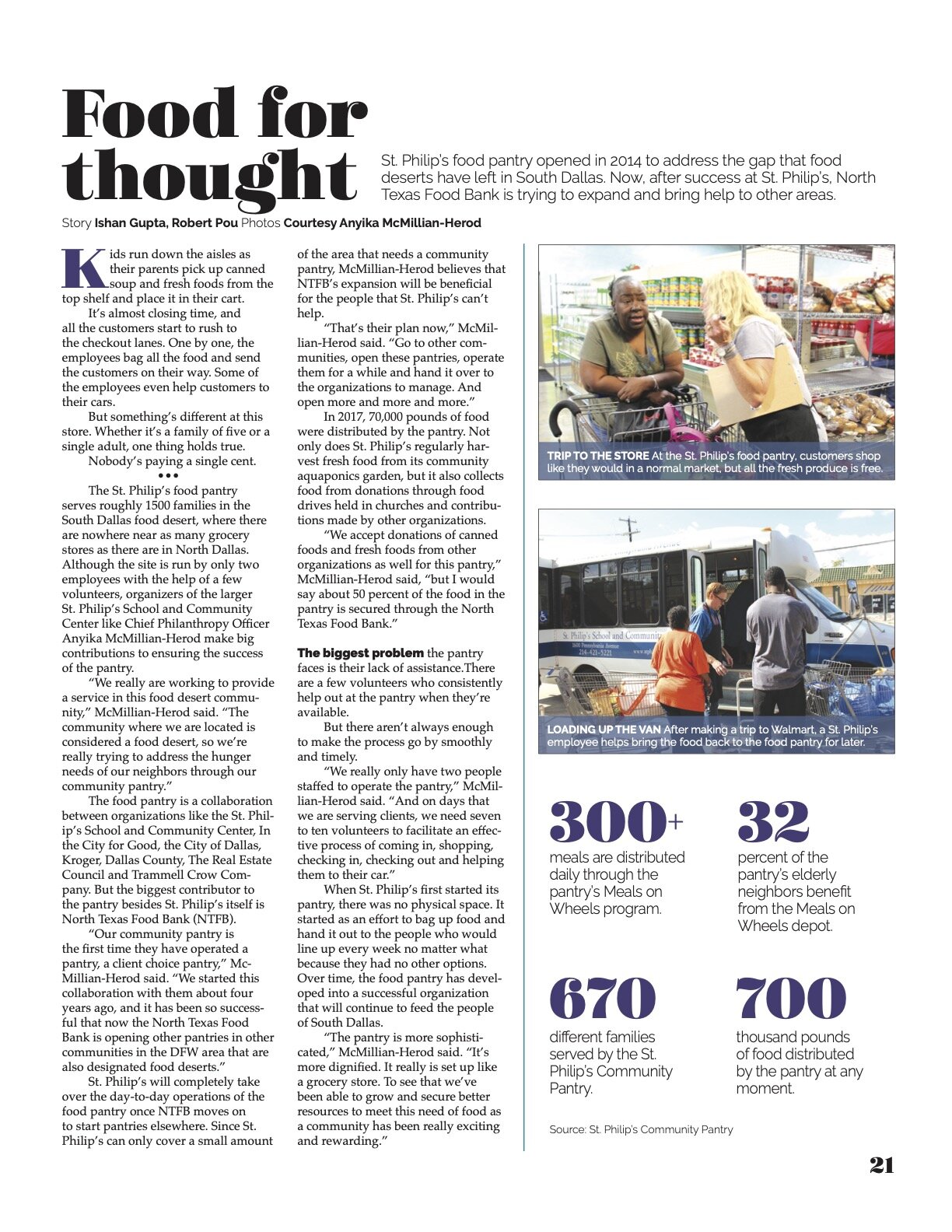
This was a piece in our single-topic Focus magazine which centered on the homeless in Dallas. I was able to visit with Anyika McMillian-Herod, and she shared some photos with me. I chose to use a modular strip for her photos and a simple design for the text itself.
Tabloid
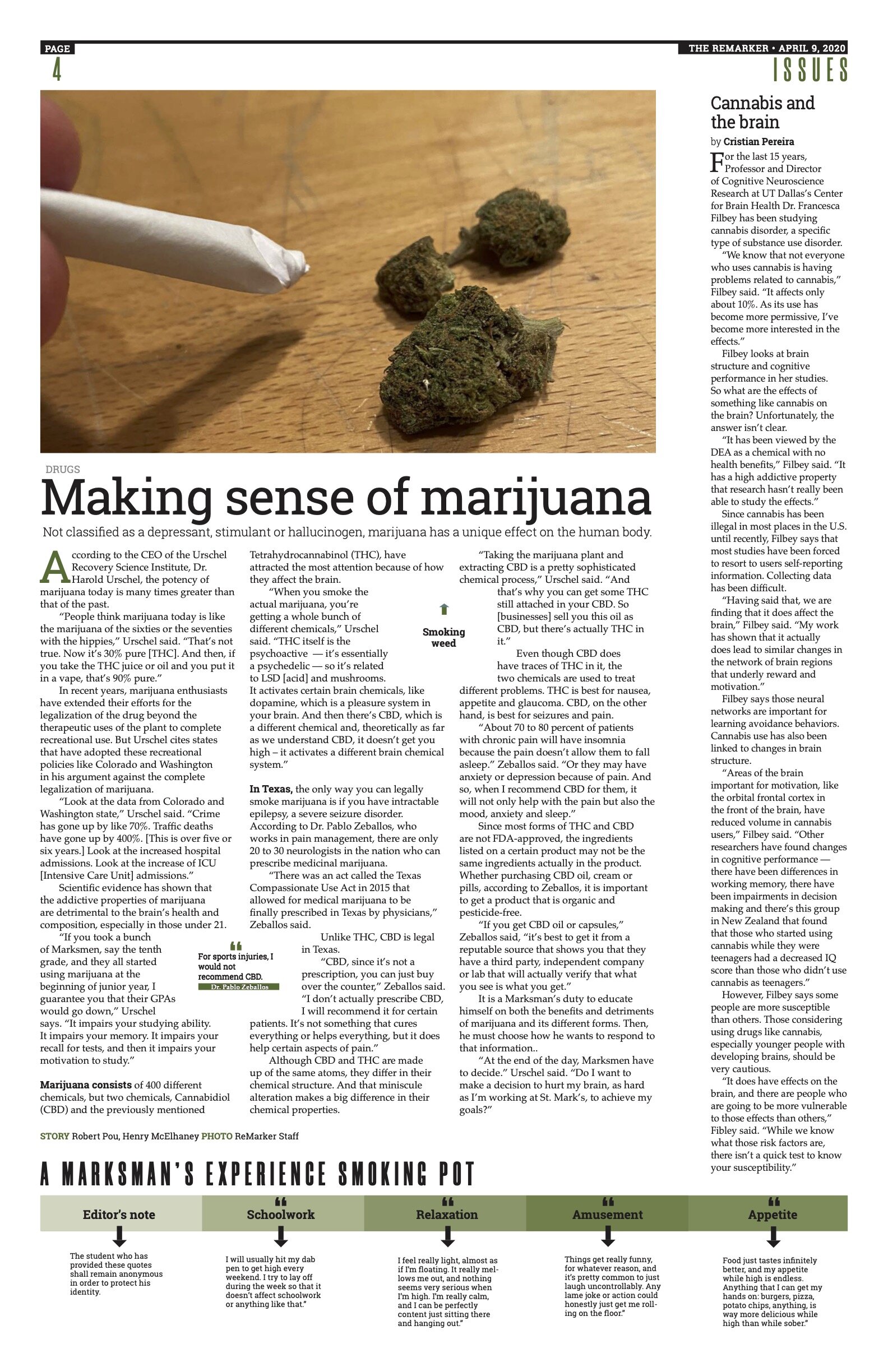
This was a story that was a long time in the making — marijuana. With more and more states legalizing marijuana — or, in some cases, approving it for medical use only — we felt it was time to cover this emerging phenomenon.
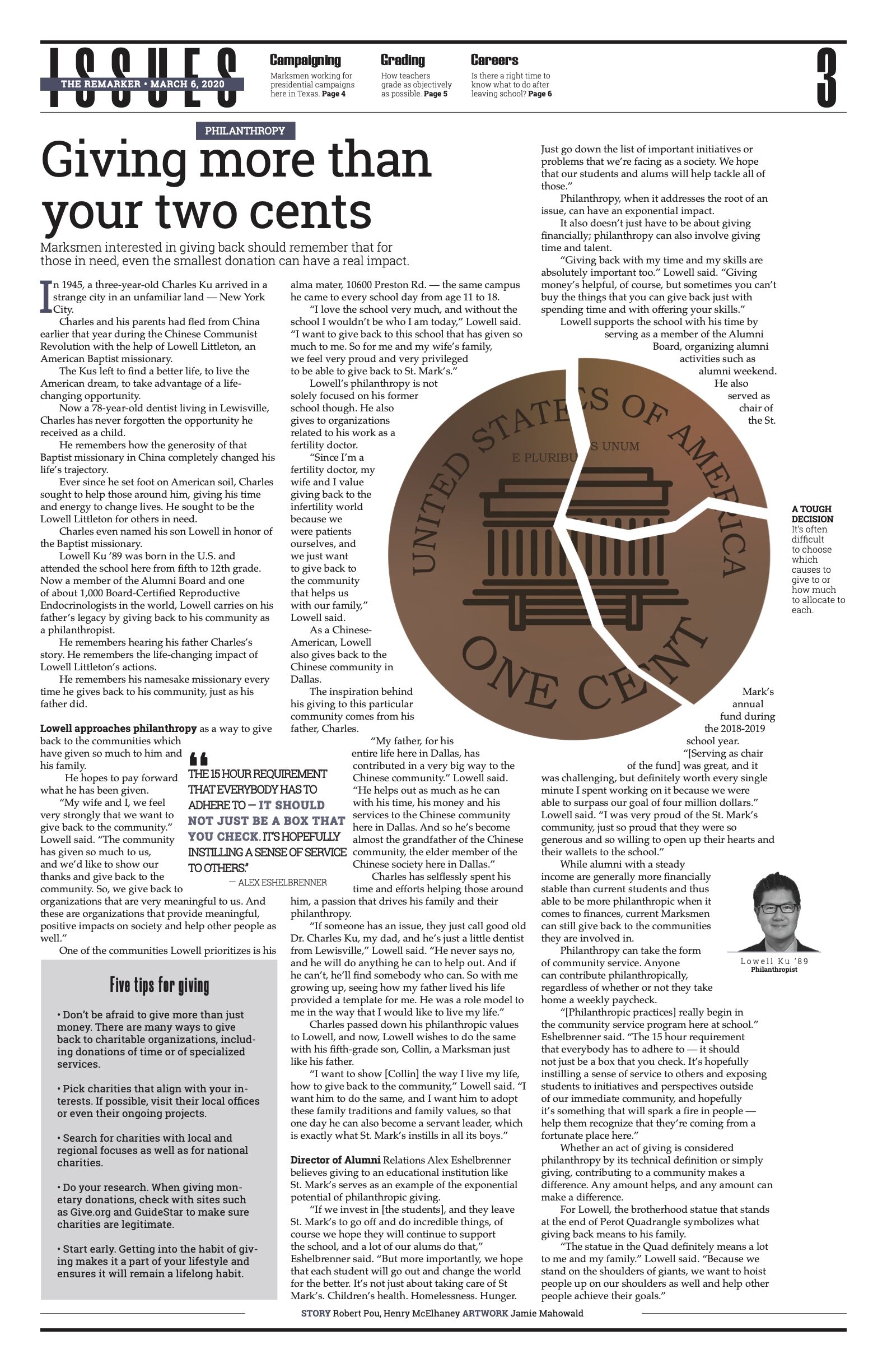
This was the lead story in our Issues section for March. It was a look a philanthropy’s importance — not just to the school, but in all parts of life. I wanted a strong graphic to attract the reader.
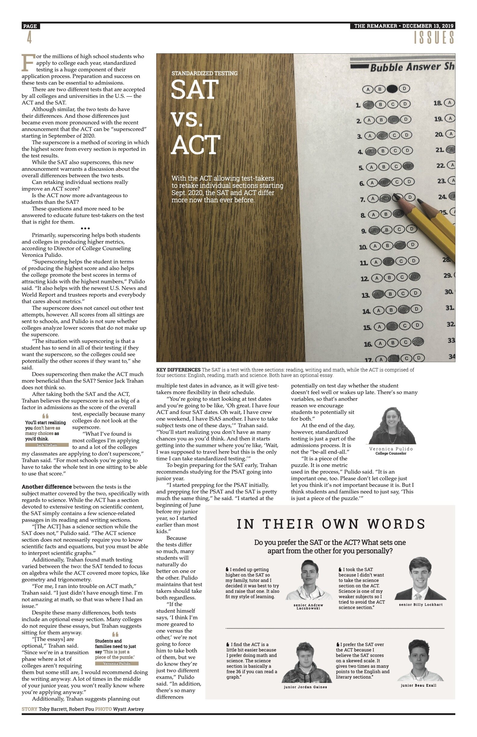
This design’s story was a comparison of the SAT and ACT test programs. Again, I was concerned that using a student in the visual might distract from the seriousness of the story, so I worked with our graphics director on an environmental portrait.
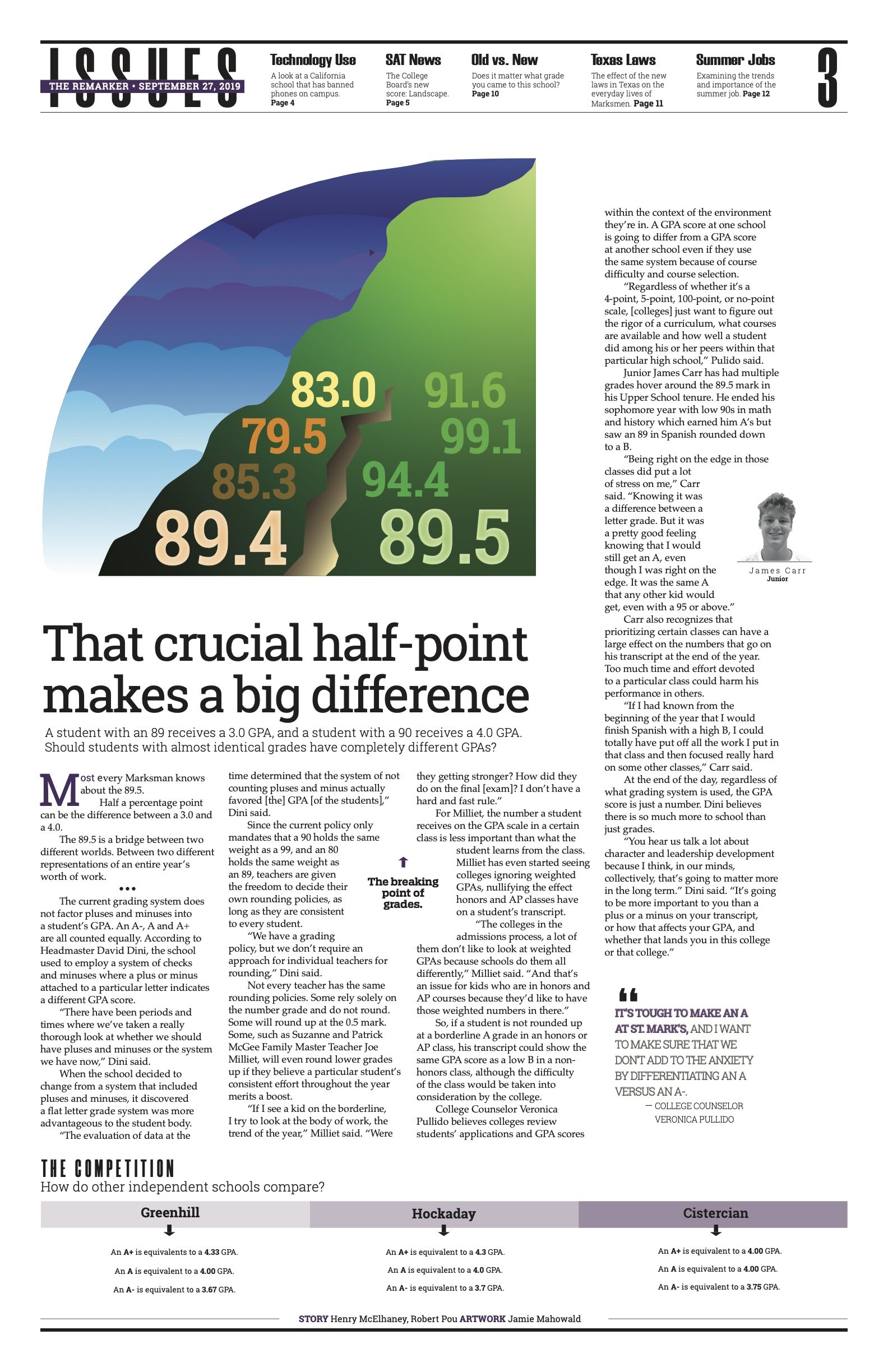
This was a very important explanatory story that we included as our main story in the section. I chose to use artwork to illustrate the wide divide in the two final recorded grades.
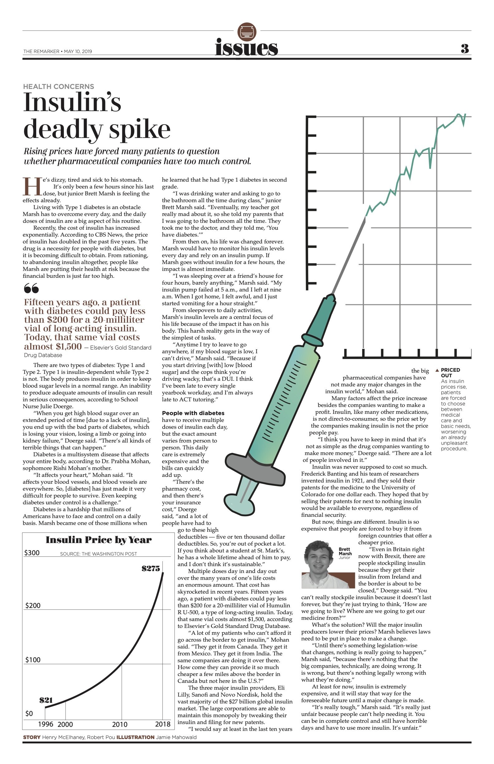
This was an important story, and I was glad I was able to present it to our community. It dealt with the rising cost of insulin — I knew several of my friends who are insulin-dependent and felt this topic needed to be explored.
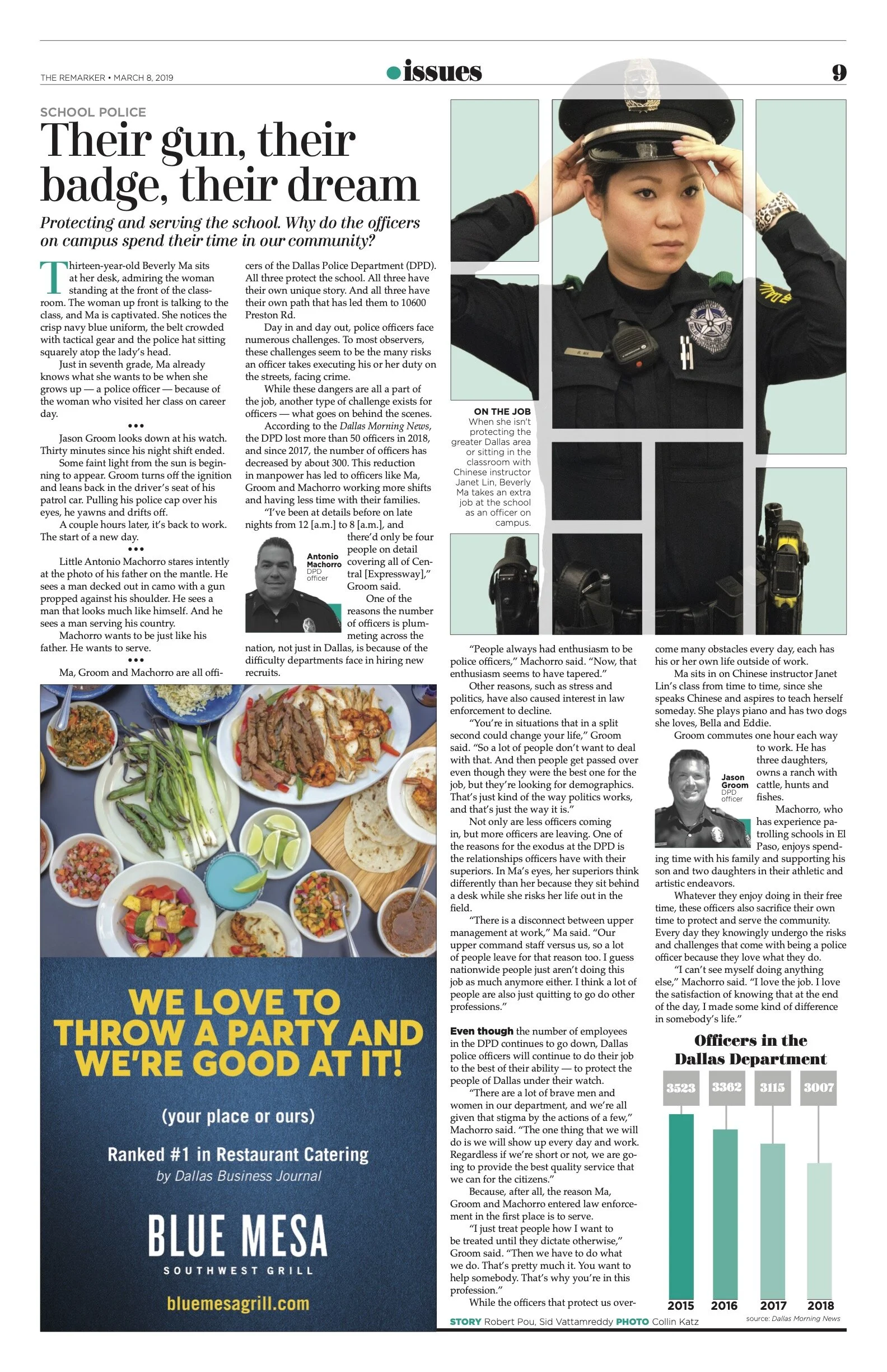
Since this story centered around a new security officer at school, I wanted to do something creative. With creative cropping and editing, I was able to get this unconventional look, which I feel is much better than a “stand and model” pose.

For this design on a story on entrepreneurship, I thought it would be fun to photograph the three boys in suits — but then, for contrast, have them displaying the tools of their trades juxtaposed against the crisp, dressy outfits.
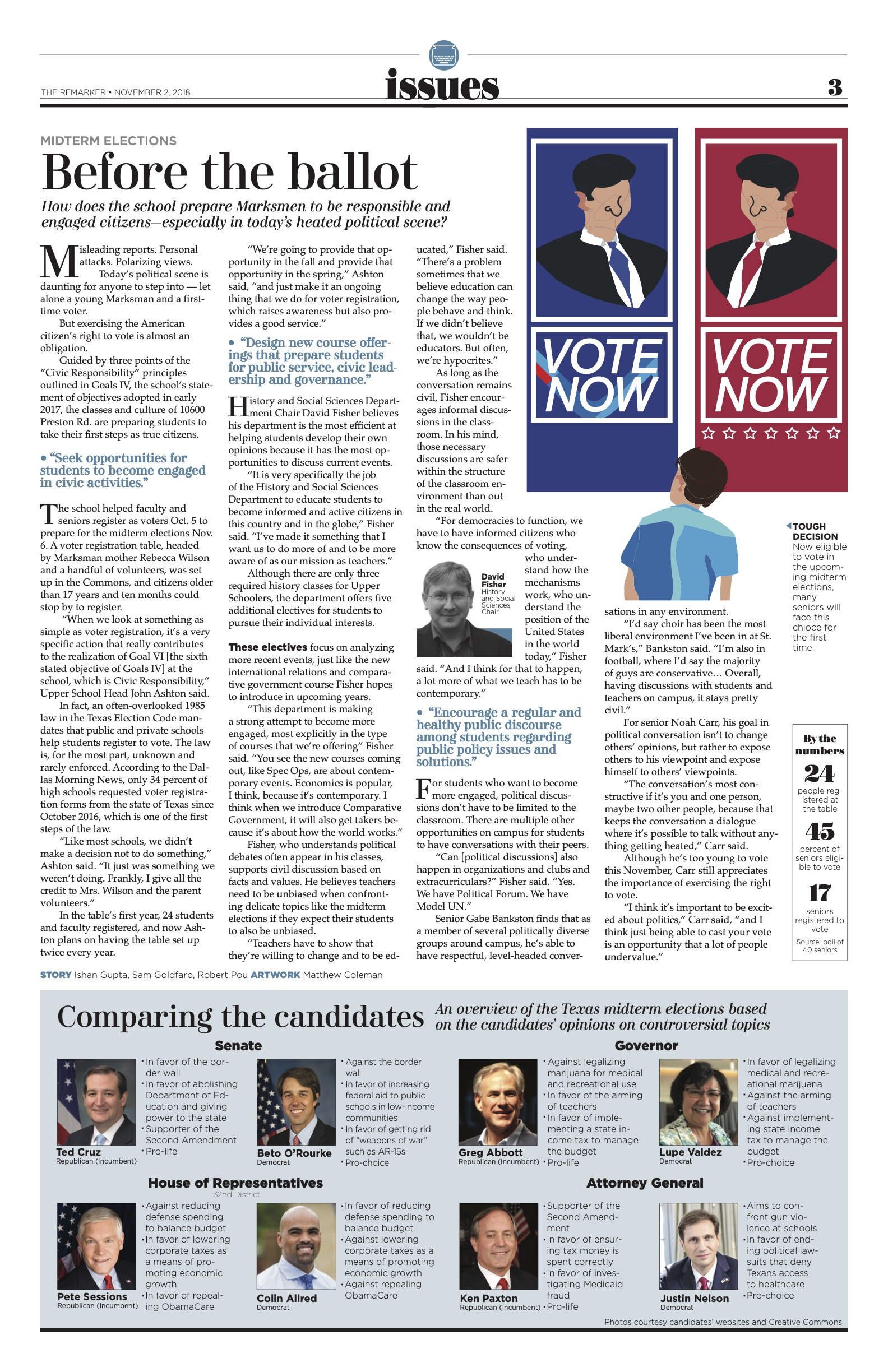
We knew we had to be careful to be fair and balanced in this piece on mid-term elections, so I chose artwork as the main visual element. I felt it would be helpful to highlight key stances of the candidates.